

The 10 Best Football Sets of the Junk Wax Era
These sets may have been overproduced, but they sure look great.

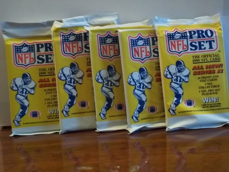
The photo above is a spoiler alert!
About a week ago, I wrote about the 10 worst football card sets of the junk wax era. But while there were plenty of bad sets in that era, there were plenty of good ones, too.
Sure, hardly any of the sets are worth a lot of money and only a select few cards go for top dollar these days (particularly if they are graded).
But these sets bring back memories of when companies could put out innovative and interesting designs with great photography. Best of all, boxes still sell for low prices in today's market.
Here is my opinion of the 10 best football cards from the junk wax era, defined as the years 1987 to 1994. There will be links to Bing search pages for each set so you can view cards for yourself.
10. 1991 Pro Line
I wasn't keen on this set when it first came out. The backs feature a player quote when I wanted to have statistics. But the set grew on me, particularly because of the unique photos. Sure, many of them are about promoting NFL apparel (the NFL had direct say over the set), but the shots were unique. On top of that, they inserted cards of players wives (Phylicia Rashad is in the set) and lots of autographed cards.
You can find images of the set here.
9. 1993 Ultra
The 1992 Ultra set was an improvement over 1991, but many of the cards looked dark, thanks to the dark green border toward the bottom. The 1993 set was a better effort, utilizing a black border and team colors. The cards were borderless around the other three edges and the logo isn't distracting. The card backs are a bit busy, but it was a better effort than the 1992 set -- and definitely superior to the 1991 set.
You can find images of the set here.
8. 1993 Pinnacle
Sometimes the simplest designs are the best. Pinnacle went with black borders for its 1993 set and kept the typeface for team name and player name small but readable. The backs look good, with a mugshot about the right size and plenty of player biographical information, although stats are limited to 1992 season plus career. It shows that you don't have to put too many bells and whistles to have a good looking set.
You can find images of the set here.
7. 1994 Fleer
Fleer seemed to have a habit of either trying too hard or not doing enough with its set. But the 1994 set was a good effort. The logo is kept small and the idea of adding the player's signature in gold foil was a nice touch. The same happened with the player's name and the team logo, but none of it was distracting. A lot of the front is devoted to the photo and the white borders allow the photo to stand out.
You can find images of the set here.
6. 1994 Pacific
Pacific may be best known for the designs for its insert sets, but its 1994 base set was a great effort. Start with a borderless photo on the front, with gold foil for the Pacific logo, player name and position -- the latter two easy to read but not dominating the front. Then look at the backs, which feature another large photo, borderless on three sides, with a profile and player stats at the bottom. The result is a quality base set.
You can find images of the set here.
5. 1994 Upper Deck
Upper Deck often delivered the hits during the junk wax era and 1994 was no exception. They went with a borderless photo on the top, bottom and right side, with the left side featuring the player's name, team and position. The back features another large photo with player stats to the left side. And they found a way to work the team colors into the left side, but in a way that really makes the cards stand out.
You can find images of the set here.
4. 1989 Score
Score's first baseball sets aren't well liked, but its first ever football set is a winner. They devoted the bulk of the card front to a player action photo. The back has a large mugshot with player stats and a bio. The colored borders on the front don't detract from the card. Also, you have plenty of top draft picks in the set. Given that production wasn't in large quantities in 1989, the rookie cards of Barry Sanders, Troy Aikman and Deion Sanders are coveted to this day.
You can find images of the set here.
3. 1991 Upper Deck
Like Score, Upper Deck's first entry into the football card market was a great effort. Upper Deck used a unique design, in which it put the team logo inside a football, but did it so that it wouldn't dominate the card front. The bars on the front matched the team colors and the player name is easy to read. The backs resembled Upper Deck's baseball sets and that was a good thing. Also, you can't go wrong with Brett Favre's Star Rookie card and the autographed cards of Joe Montana and Joe Namath.
You can find images of the set here.
2. 1991 Stadium Club
Topps faced some serious competition during the junk wax era and responded with one of the best football sets ever. There are no borders on the front, meaning the bulk is devoted to a player photo, with most of them being game action shots. The names on the front are easy to read and the backs look good. Brett Favre is the key rookie card in the set, though Topps misspelled his name on the front. Oh well, can't win them all.
You can find images of the set here.
1. 1990 Pro Set
Yes, Pro Set was a company that went overboard with its "living set" concept, the errors and variations and issues with cards never making it into a set. But look at the design of these cards. It's the first set to use no border on the sides, allowing photos to be larger. The photo selection is great. The bars that match team colors really add to the design. And the backs are clean, featuring a player mugshot (in which the player doesn't wear a helmet in most cases) and plenty of stats and biographical information. Pro Set might have gone too far with gimmicks, but in terms of the look of the cards, the 1990 set is one of the best.
You can find images of the set here.